Chat buttons play an important role in chat generation. The better and more visible your chat button is, the more people will use it to start a chat.
Chat button creation is a two-step process. First, you need to decide how your button will look like. You can design the button or pick one from a gallery of ready-made examples.
The next step is to place the button on your website. You need to do it carefully since even the best chat button won’t generate many chats if it is placed poorly.
Add a chat button to your website 
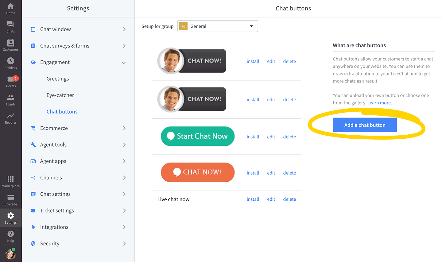
Start off by going to the Chat buttons section. Here, you will be able to upload a new button or choose one from a gallery and then generate the code for it.

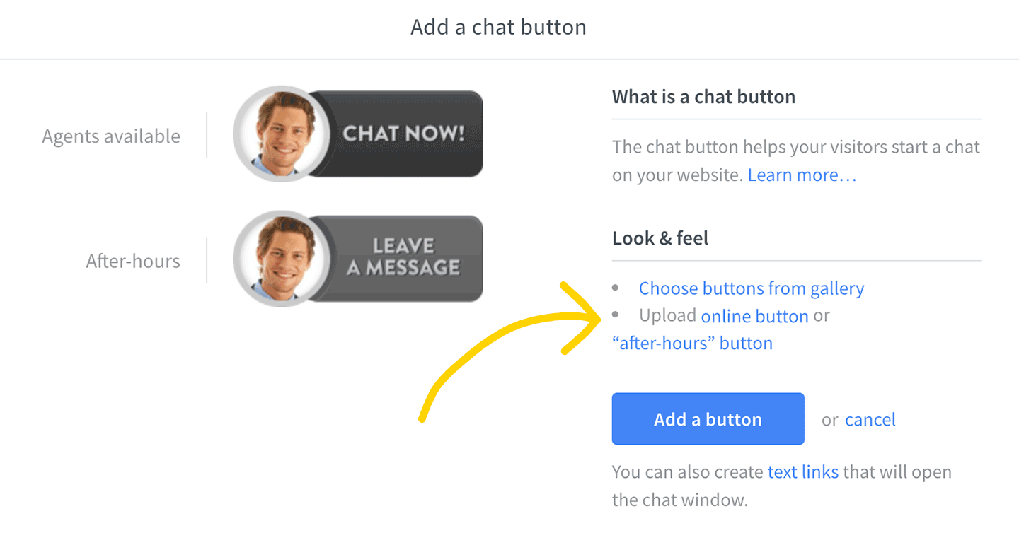
If you want to upload your own graphic, click on Add a chat button and then on Upload online button. We recommend using PNG format since it can handle transparency and the file size is relatively small, allowing for short loading times. Remember to finalize the change by selecting Save changes.
 Avoid uploading buttons that take a lot space - they should be easily visible, however, they also shouldn’t be too overwhelming. A button that is too big will be a nuisance when looking for information on your site.
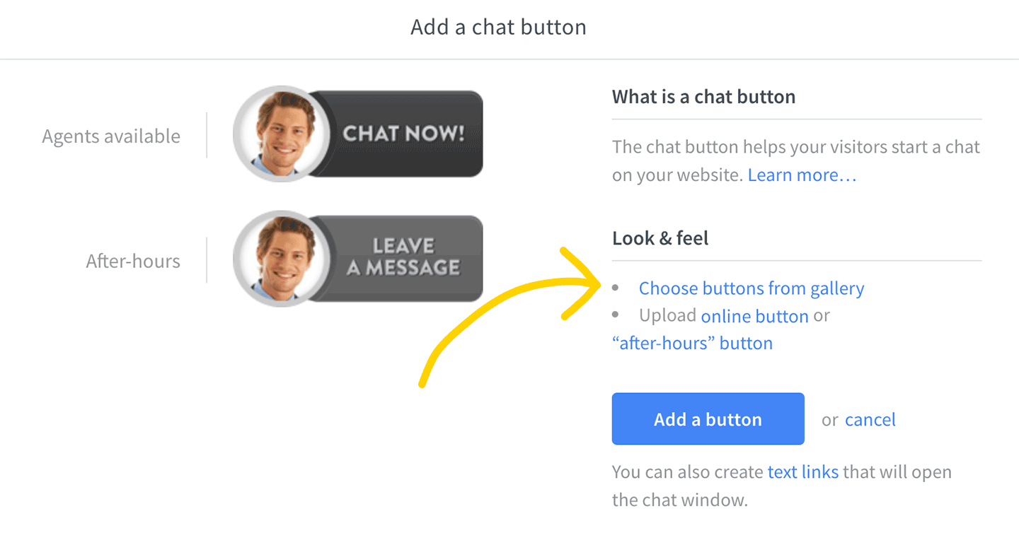
You can also select a button from a pre-made gallery. To do this, click on Choose buttons from gallery after editing or adding a button.
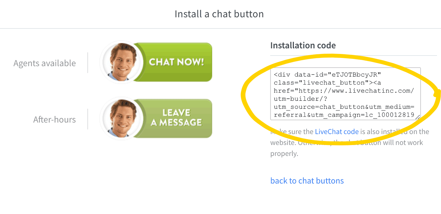
 When you are done with choosing or uploading your button, you can copy its code, paste it into your website source and publish the changes.
 Wanna learn more? Refer to our webinar about chat branding and customization in which we discuss chat buttons.
Button placement
When choosing a good place for your chat button, you will have to remember about a few things. Giving your visitors a way to contact you is important, however, it shouldn’t be presented as the main aspect of a given site.
A really bright button may be easily noticeable, however, you should get one that is toned down. This way your visitors won’t have a problem with starting a chat and also nothing will distract them.
You should place your button in an easy-to-reach and visible place, like the top of your page, to get the best results.

